
Found under the Home Ribbon within office 365 apps like Word, OneNote and Teams using heading styles is a good way to start making your documents more accessible.
When constructing a resource in Word for example using different heading styles can help keep your resource accessible. People using screen readers and utilizing the Navigation Pane found under the View Ribbon will benefit from being able to quickly go through the key topics of a document. Having all of the headings read to them, they can then choose which section to read first.
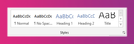
Different apps have different heading styles available but the key ones are Title, Heading 1 and 2 however there are lots to choose from so you need to see which will work best for your document. Highlight your text in the document then apply your chosen heading style by selecting it in the Style section in the Home Ribbon.
By using heading styles you can easily structure and organize your content. Keep the content itself clear, short and simple, put information into smaller chunks and use language that is uncomplicated. A simple font like Arial, Calibri or Verdana will keep your document accessible and easy to read. All of these tips will help make your resources inclusive and easer to navigate and for a screen reader to read.
Check out Microsoft’s training video below on how this work below:
If you have any questions contact the Digital Learning Team at: digitallearning@loucoll.ac.uk and don’t forget to check our blog again tomorrow for the next instalment in our Accessibility bite size blog series.