When putting together new resources whether in Word, PowerPoint or any of Microsoft’s suite of apps you need to think about the colours you use, be it the background or text colour or even the colour and contrast of shapes, charts and images, especially when they include text.
When picking images, fonts, and colours, you need to make sure the colours you use have enough contrast between text and background.
Best practice is to use high contrast colours, for example with a white background using a black or dark blue font or white on a dark blue background.
Red–green colour blindness is the most common form, followed by blue–yellow color blindness and total color blindness so avoid these colour combinations.
If text or graphics in your document are hard to read or to distinguish from the background, something needs changing.
You should also avoid using colour as the only means of conveying information, make sure you add descriptive text as well.
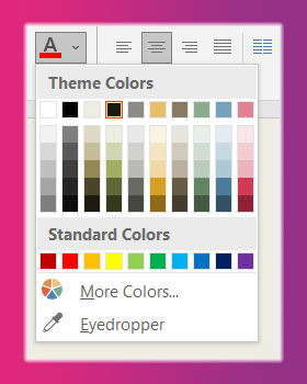
In all Microsoft office apps, the options to change font and background colours are found on the Home tab of the ribbon in the font section. You can select your choice of colours before beginning your work or highlight text you wish to change. see figure 1.
An easy way to find out if you are getting it right is to use the Accessibility Checker.
Accessible Templates
Don’t worry help is at hand Microsoft offers a range of PowerPoint free templates and themes that are already accessible. They use using good contrasting colours, placeholder images, text, and headings, with instructions on how to easily adjust and change them.
Check out this Microsoft training video below on using more accessible colours in your power presentations:

As well as colour and contrast reading order is also a key part of making a PowerPoint accessible as this determines the order in which a screen reader will read the contents aloud.
If you have any questions contact the Digital Learning Team at: digitallearning@loucoll.ac.uk and don’t forget to check our blog again tomorrow for the next installment in our Accessibility bite size blog series.


